


A New Look for Alienhood 👁

IN 1863, TREASURY Secretary Salmon Chase published a classified notice in The New York Times inviting “artists, engravers, and others” to submit designs to be printed on the first nationally circulated currency of the United States. Although paper currency had been around in the colonies as far back as 1690, issued under the authority of the Province of Massachusetts Bay, Congress in 1861 finally passed a law that standardized the currency.
It’s unclear how many proposals ended up being submitted, but we do know the first designs included romanticized depictions of settler-colonial American founding mythology, like the landing of Christopher Columbus, Hernando DeSoto’s “discovery” of the Mississippi River, the later Battle of Lexington, the signing of the Declaration, and George Washington’s resignation of his commission as commander-in-chief of the Continental Army. If any of the Indigenous peoples who were already living here are depicted, they’re naked, shocked, debased, and physically relegated to the sidelines. The $20 bill did put Pocahontas at the center—during her baptism.
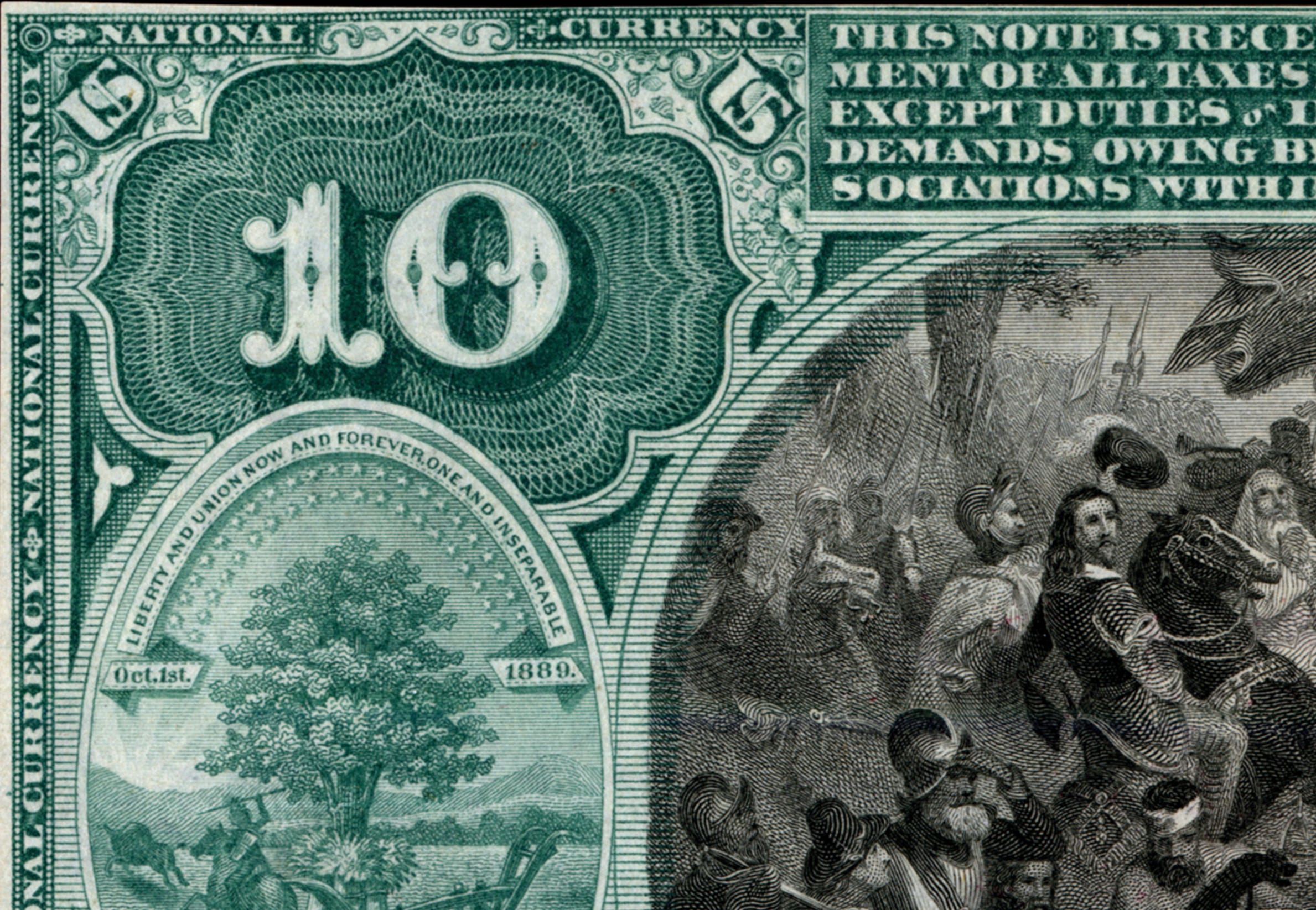
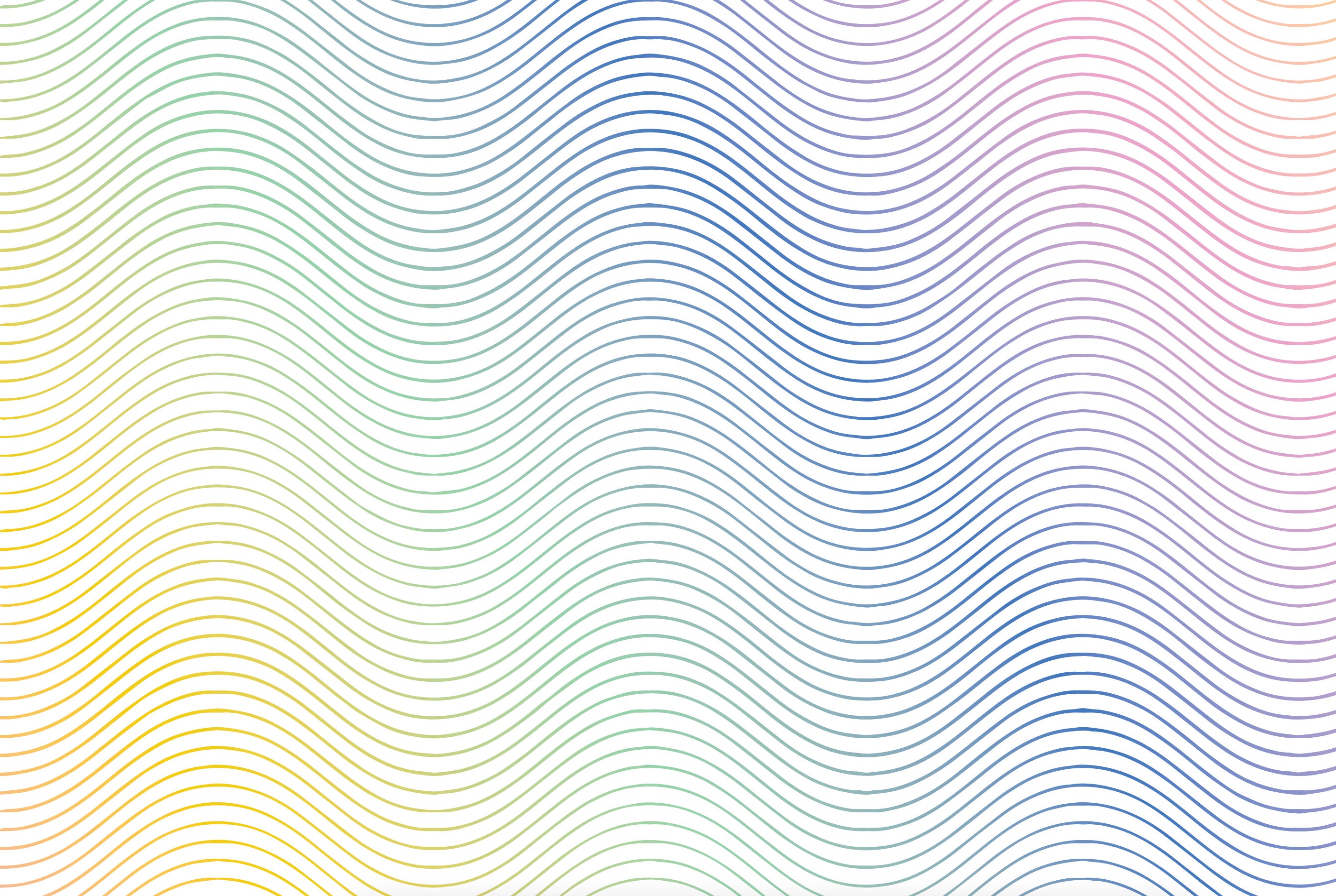
These scenes are surrounded by gorgeously ornate details: marquees, swirls, flowers, stars, and more. One of the patterns that re-appears in these papers is the guilloché.
I have long been fascinated by this pattern, but it wasn’t until recently that I learned its name. For the past month and a half, I have been working with a designer based in Tulsa, Ryan Fitzgibbon, to create a visual identity for this newsletter. The kind folks at Substack put me in touch with him, and we set up an initial call to get ideas flowing. Some people struggle with not having a direction, but I had at least three million of them, and, helpfully, no real preference among them. I knew that I didn’t really want the on-the-nose imagery of literal aliens on my newsletter, nor did I want to stick to a digital theme with pixelated fonts. Ryan took that and started sending images, art, and fonts that might just get a reaction out of me.

In between one of those email exchanges, I started thinking more and more about where exactly I had seen the image I was picturing: an engraving’s detail, perhaps a wood-block print. Lines that together formed a larger whole. After some googling around—“paper designs” → “passport design” → “passport paper design pattern illustration curves”—I came across guilloché.
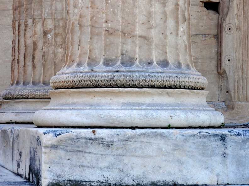
Guilloché is a decorative pattern that has been used for ages. It’s a set of flowing curved lines stacked on top of each other, sometimes braiding, sometimes forming what look like concentric flowers, and it can be engraved using a rose machine or straight-cut machine. It is ancient: there’s guilloché in the Acropolis, in Assyrian architecture, and in the Latin American Andes. It grew to have a significant influence in 18th-century watchmaking, appearing on the dials of pocket watches. According to The Hourglass:
The artisan … personally engineers the process by turning the cranks of the tools to rotate and orientate the dial, while applying various amounts of pressure to advance the dial against a cutter for it to be cut and to determine the depth and consistency of the engravings. … Even the slightest wobbling of the hand will desecrate the dial.
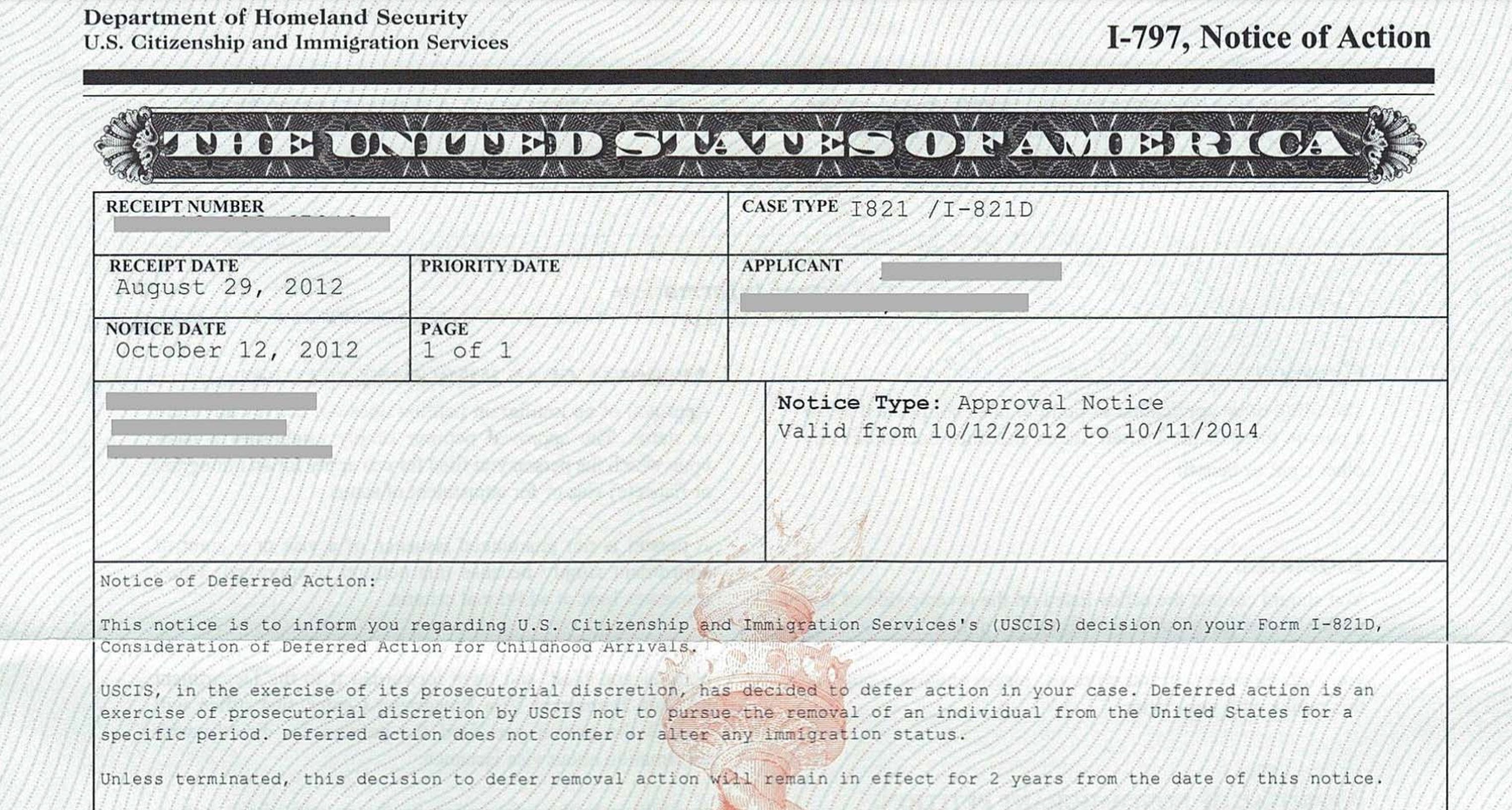
I remember the pattern so distinctly because I’ve noticed it each of the many times I have stared at my passport or government notices and letters. I’m not sure how it made its way to these kinds of documents, or what their purpose is — are they some kind of security measure, or are they just pretty? If guilloché is supposed to make paper safer, I assure you it doesn’t: notarios still defraud immigrants all over the country. If the pattern is merely ornamental, then it raises the question: What, exactly, are we adorning? I digress.
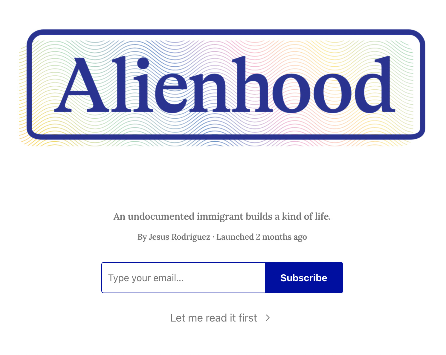
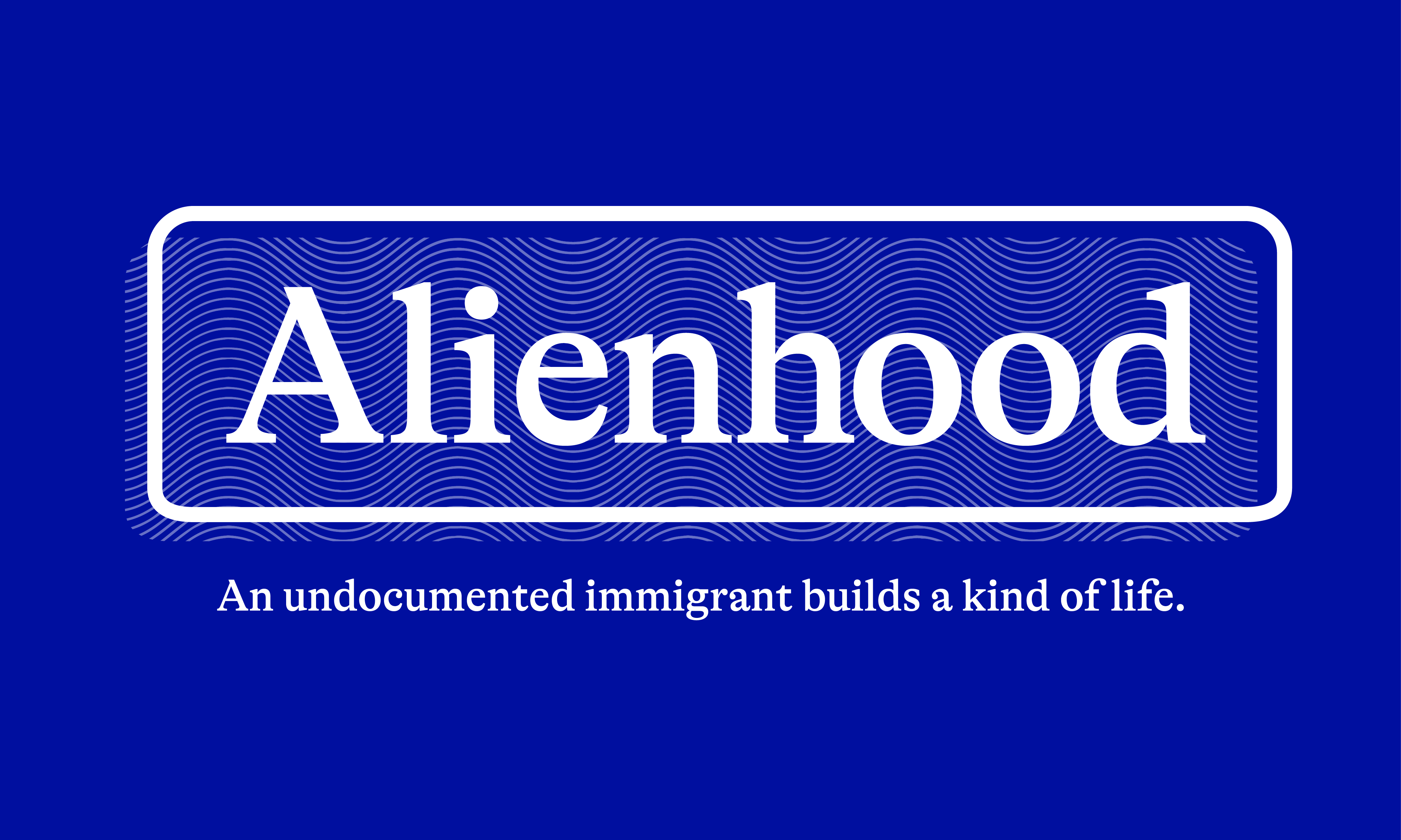
Ryan delightfully incorporated this pattern into Alienhood’s new logo, creating something I don’t think I knew I wanted and pairing it with some lovely colors:
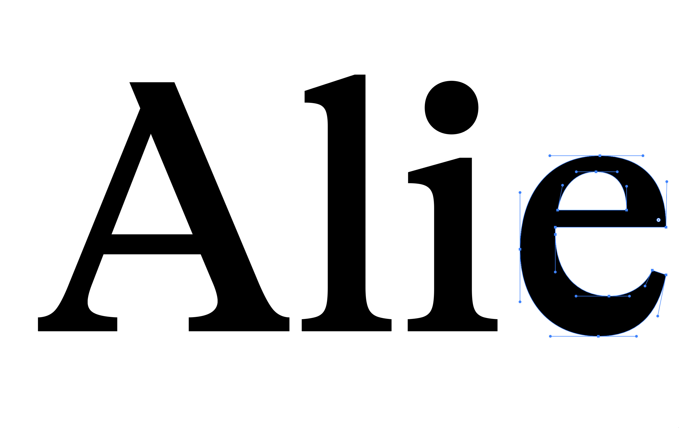
Then there was the font. When I wasn’t staring at the samples he sent, I’d visualize the different fonts in my head. I’d fixate on the spaces between the letters, the dots on the lowercase i, the bottom curves of the e. Then I’d text friends, who’d be like, These are essentially the same thing. I went on font websites and generated samples of the newsletter’s title, which then presented it in a bunch of different styles. Alienhood. Alienhood. Alienhood. Ryan, though, narrowed it down to a little font I had never seen, called GT Alpina, and it ended up being the best one.
And to top things off, the logo came with the perfect color, a midpoint between ink blue and ultramarine.
As someone whose entry into journalism was as a layout editor for their college newspaper, I so appreciated getting the chance to work with a professional designer on this project and feeling like I could be picky without feeling picky. And I hope this newsletter will keep this look and feel for a very long time.
And if you’re intrigued to see how guilloché is made, watch this clip below:
Love this look and reading about the process of landing on it. Thanks for sharing!
I love the new look, and the story behind it.